ice_cream <- read_csv("https://bcdanl.github.io/data/ben-and-jerry-cleaned.csv")
Let’s analyze the ice_cream data:
rmarkdown::paged_table(ice_cream) ggplot Analysis
Figures
top10 <- ice_cream %>%
  count(flavor_descr) %>%
  arrange(desc(n)) %>%
  head(10)

top10_full <- ice_cream %>%
  filter(flavor_descr %in% top10$flavor_descr)

ggplot(data = top10_full,
       mapping = aes(x = flavor_descr, y = priceper1, fill = flavor_descr))+
  geom_boxplot()+
  scale_y_continuous(labels = scales::dollar_format())+
  labs(
    title = "Price Distribution of the Top 10 flavors",
    x = "Flavor",
    y = "price"
  ) +
   theme(
    axis.text.x = element_text(angle = 45, hjust = 1),
    axis.title.y = element_text(angle = 90)
  ) +
  scale_fill_brewer(palette = "Dark2") +
  theme(legend.position = "none")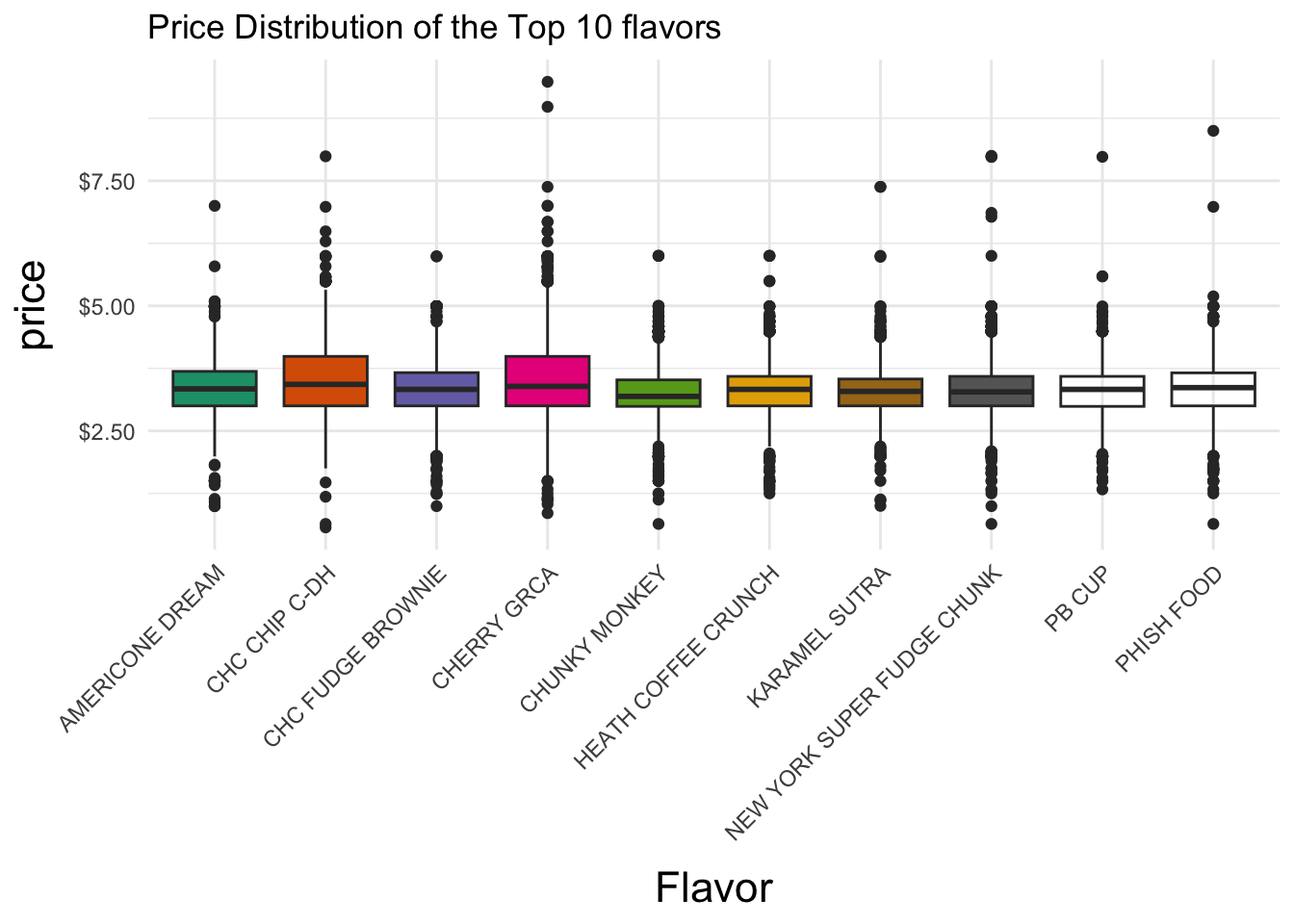
Interpretation
This figure shows boxplots of the prices paid for each of the most popular flavors in the ice_cream data.frame. All show median prices that are approximately equal. Additionally, all show very similar varriances in pricing, as their IQR’s and overall ranges are near equal.
ggplot(data = ice_cream,
       mapping = aes(x = region))+
  geom_bar(mapping = aes(fill = race), position = "fill") +
  scale_color_tableau() +
  labs(
    title = "Race Proportions by Region",
    y = "Proportion",
    x = "Region"
  ) +
  theme(
    axis.title.y = element_text(angle = 90)
  ) +
  theme_calc()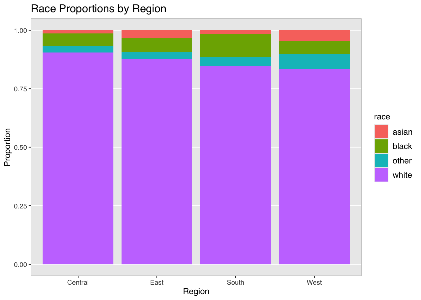
Interpretation
This figure analyzes the distribution of race on the basis of region. As seen, race status of white dominates across all regions. Regions with notable minority populations would be South, as it possesses the highest proportion of black race observations, as well as West, as it possesses the highest proportions of both other and asian observations. These proportions, although derived from a data.frame about ice cream sales, speak to historical population dynamics in America.
ggplot(data = ice_cream,
       mapping = aes( x = married,
                      y = household_income,
                      fill = race)) +
         geom_boxplot()+
  scale_y_continuous(labels = scales::dollar_format())+
  theme(
    axis.text.x = element_text(angle = 45, hjust = 1),
    axis.title.y = element_text(angle = 90)
  ) +
  labs(
    y = "Household Income",
    x = "Married Status",
    title = "Household Income by Race and Married Status"
  )+
  scale_fill_brewer(palette = "Dark2") +
  facet_grid(~race) +
  theme_calc()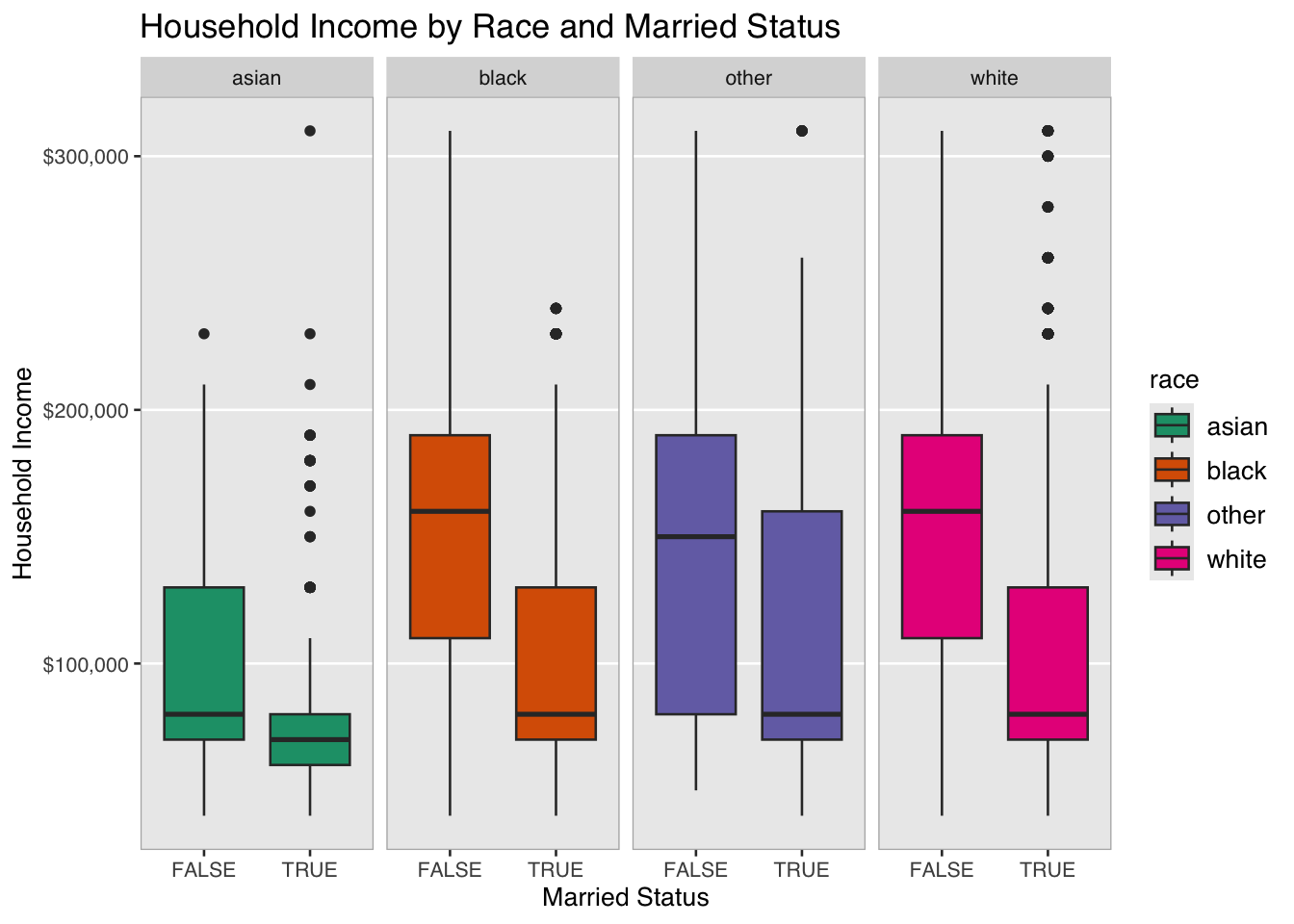
Interpretation
This figure shows how household income varies across married and race. Across all races, a married status of FALSE tends to have a higher income. Additionally, the race status of asian seems to have a significantly lower value for both married and non-married status.
ggplot(data = ice_cream,
       mapping = aes( x = household_size)
       )+
  geom_histogram(binwidth = 1,
                 fill = "lightblue")+
  facet_wrap(~race,
             scales = "free_y")+
  labs(
    x = "Household Size",
    y = "Count",
    title = "Distribution of Household Size by Race")+
    theme(
    axis.title.y = element_text(angle = 90)
  ) +
  theme_calc()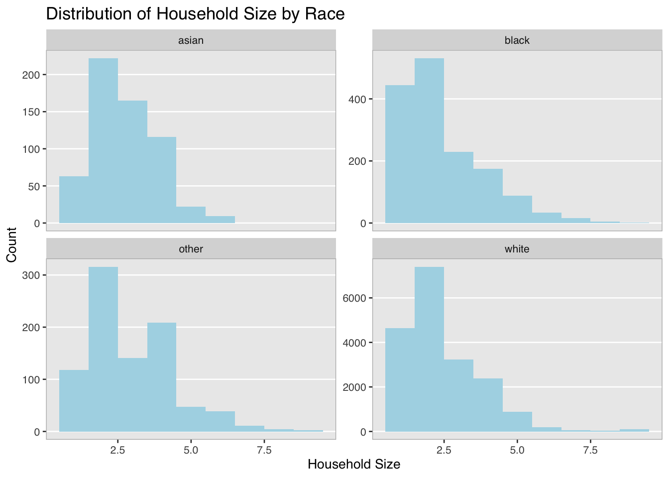
Interpretation
This figure shows the distribution of household_size across race, with y axis appropriately scaled for comparisons between races. The other category has the least-skewed distribution with regard to household_size, followed by asian households. black and white households show very similar distribution patterns, despite a much larger sample size for the white category. All races are right-skewed to some extent.
Summary Table Analysis
Question: Is household_income for each region influenced by the race distrubtion with each region?
df2 <- ice_cream %>%
  group_by(race) %>%
  summarise(mean_inc = mean(household_income))

rmarkdown::paged_table(df2)
Lowest income race is asian, going off a grouped mean calculation for each race.
df3 <- ice_cream %>%
  group_by(region) %>%
  summarise(mean_inc = mean(household_income))

rmarkdown::paged_table(df3)
The lowest income region is East, going off a grouped mean calculation for each region.
df1 <- ice_cream %>%
  group_by(race, region) %>%
  summarise(n = n())%>%
  ungroup() %>%
  group_by(race) %>%
  slice_max(order_by = n, n = 1)

rmarkdown::paged_table(df1)
This table shows where each race is found most frequently.
Interpretation
The lowest income race in this data.frame is asian, and the lowest income region is East. The region in which the asian race is found most commonly is within the West. According to this data, it could be inferred that the low relative income seen in the East is not caused by low relative income seen in the demographics that dominate the region, nor is causing poverty disproportionately amongst certain races.